Digiaccel — Brand Identity
This project focused on shaping a clear and flexible visual system for Digiaccel, with an emphasis on consistency, clarity, and adaptability across digital touchpoints. The identity was built around simple, modular forms and a restrained visual language that could scale across static, motion, and interface-led communication.
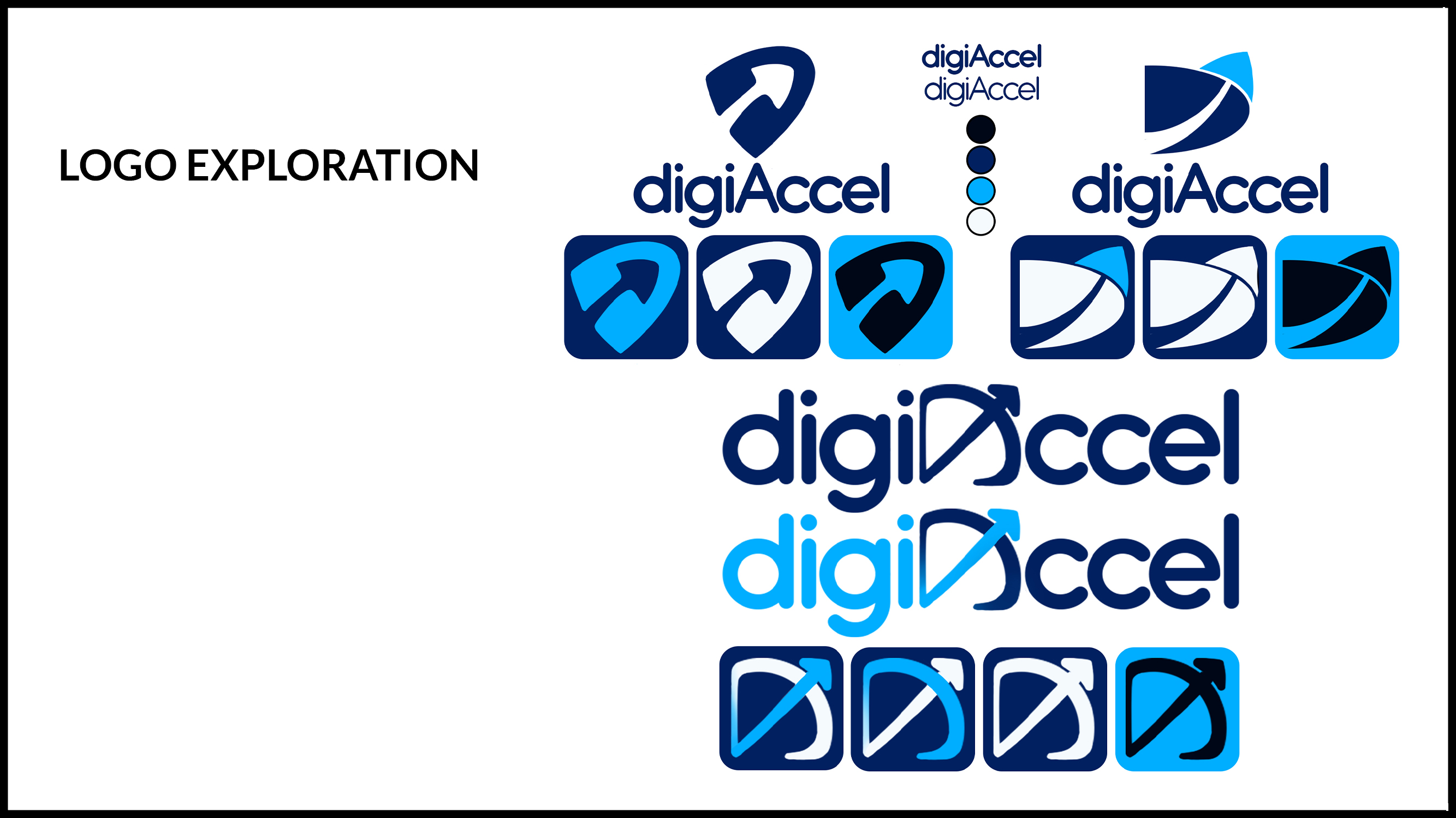
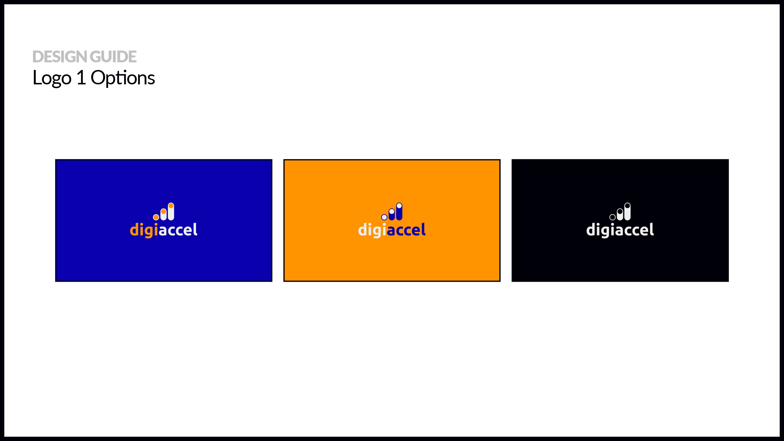
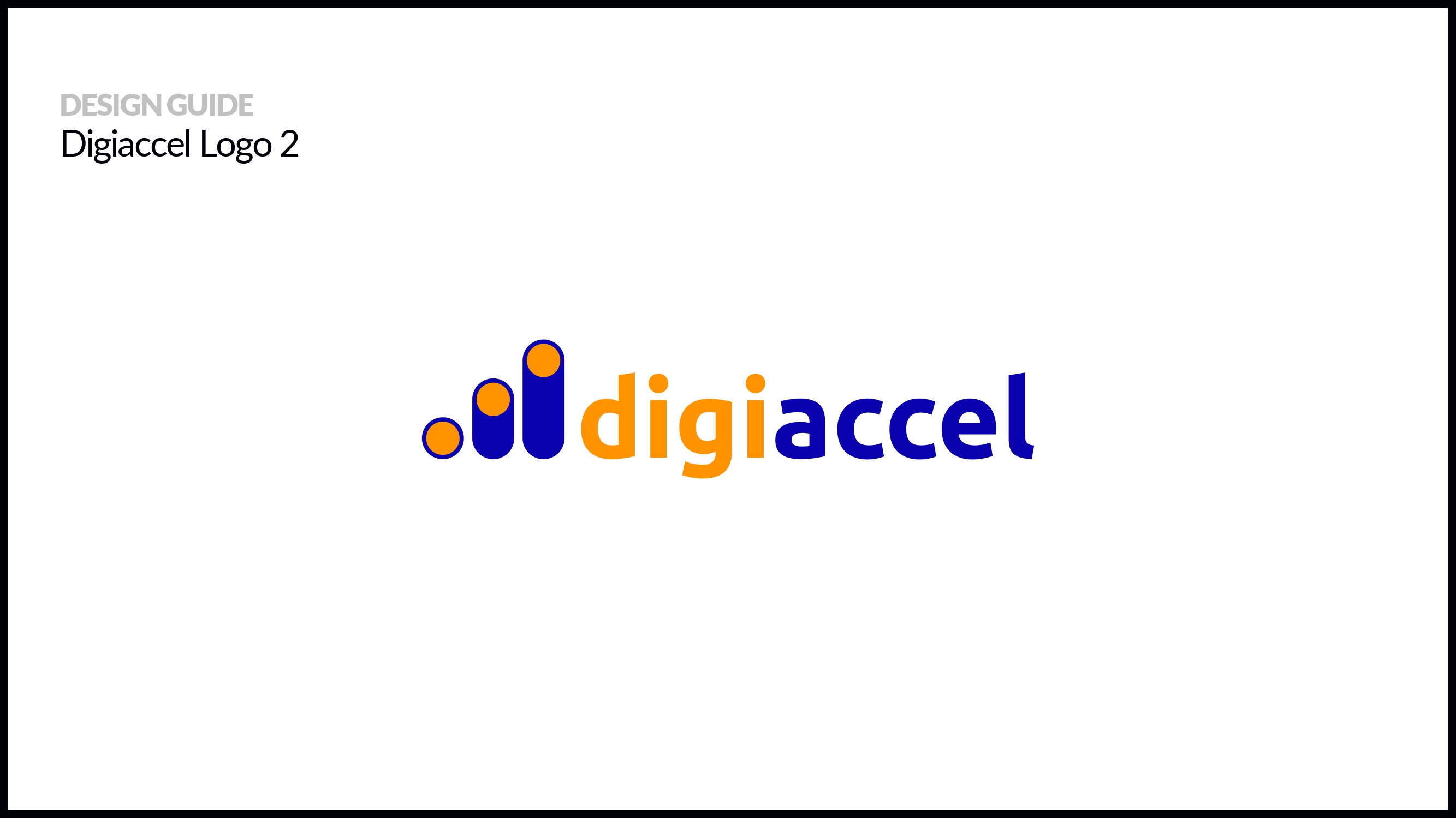
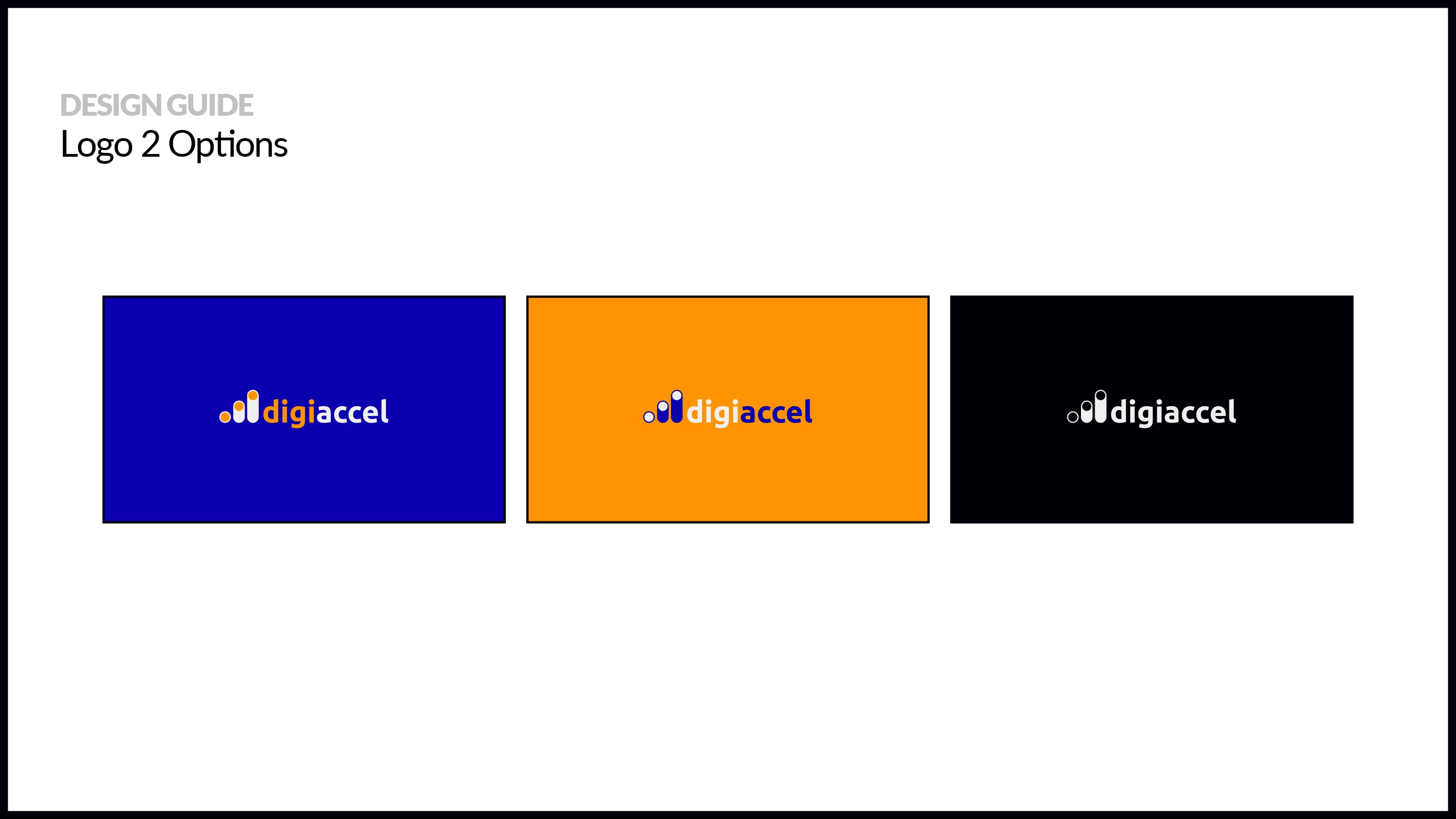
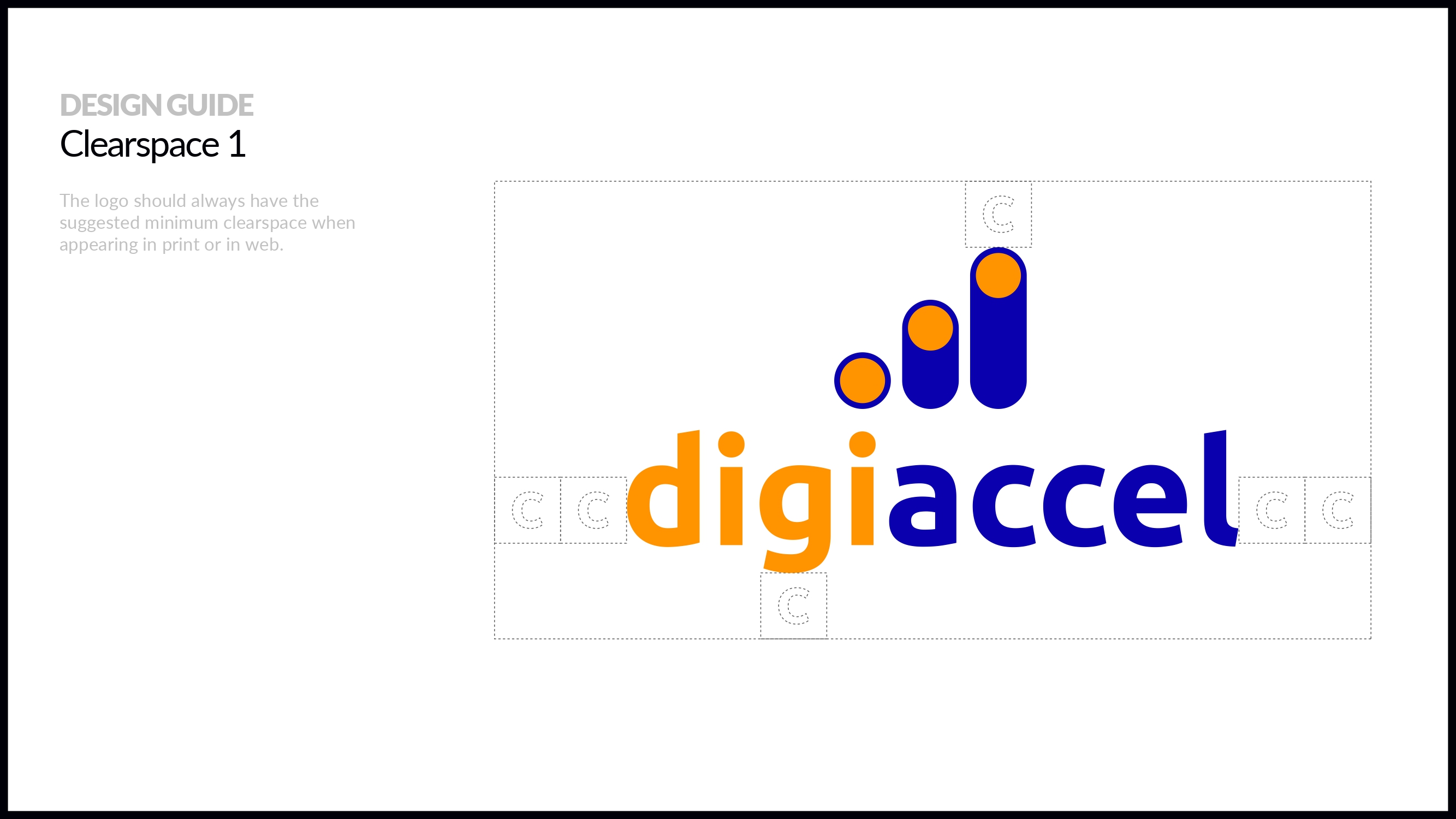
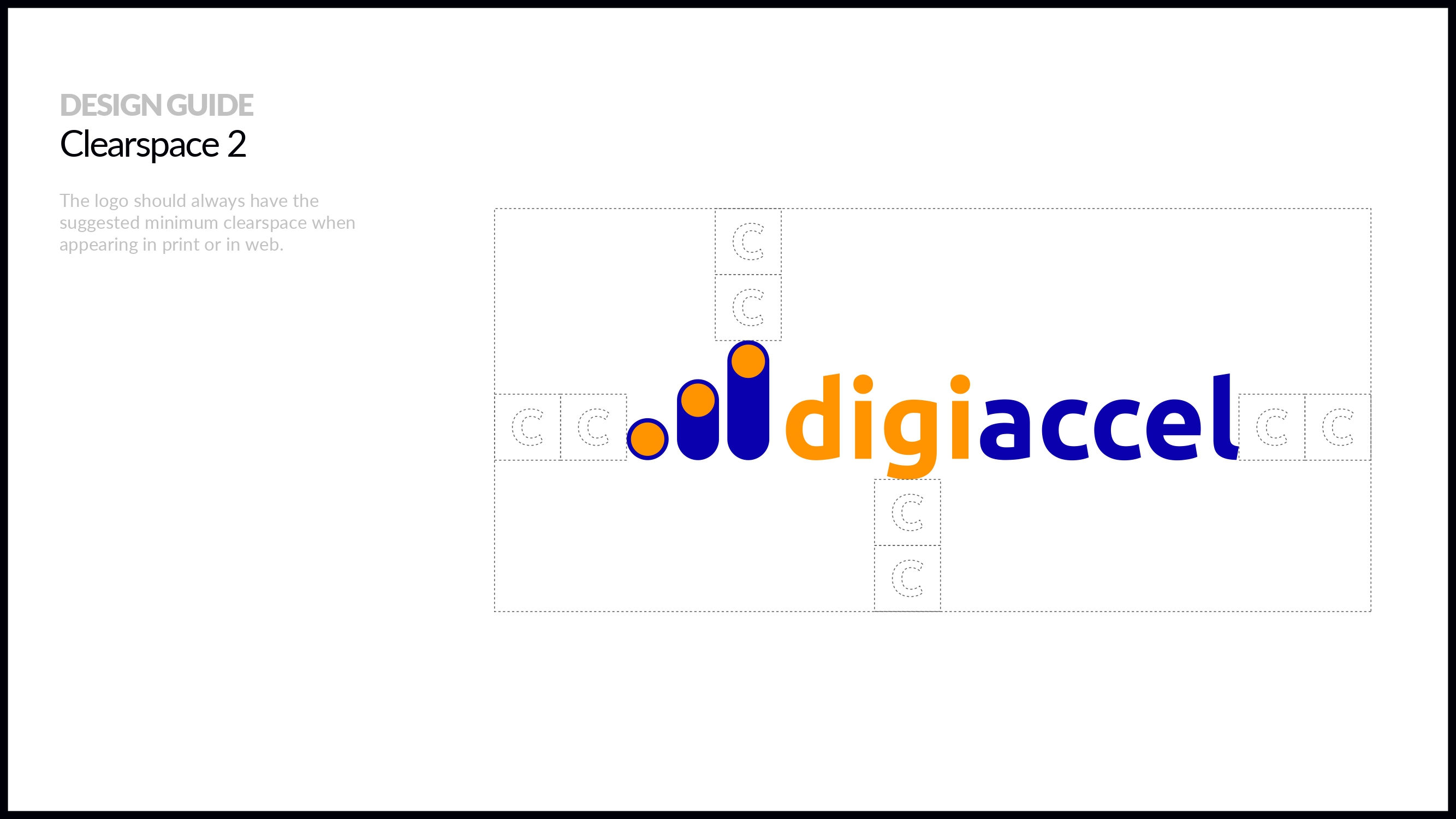
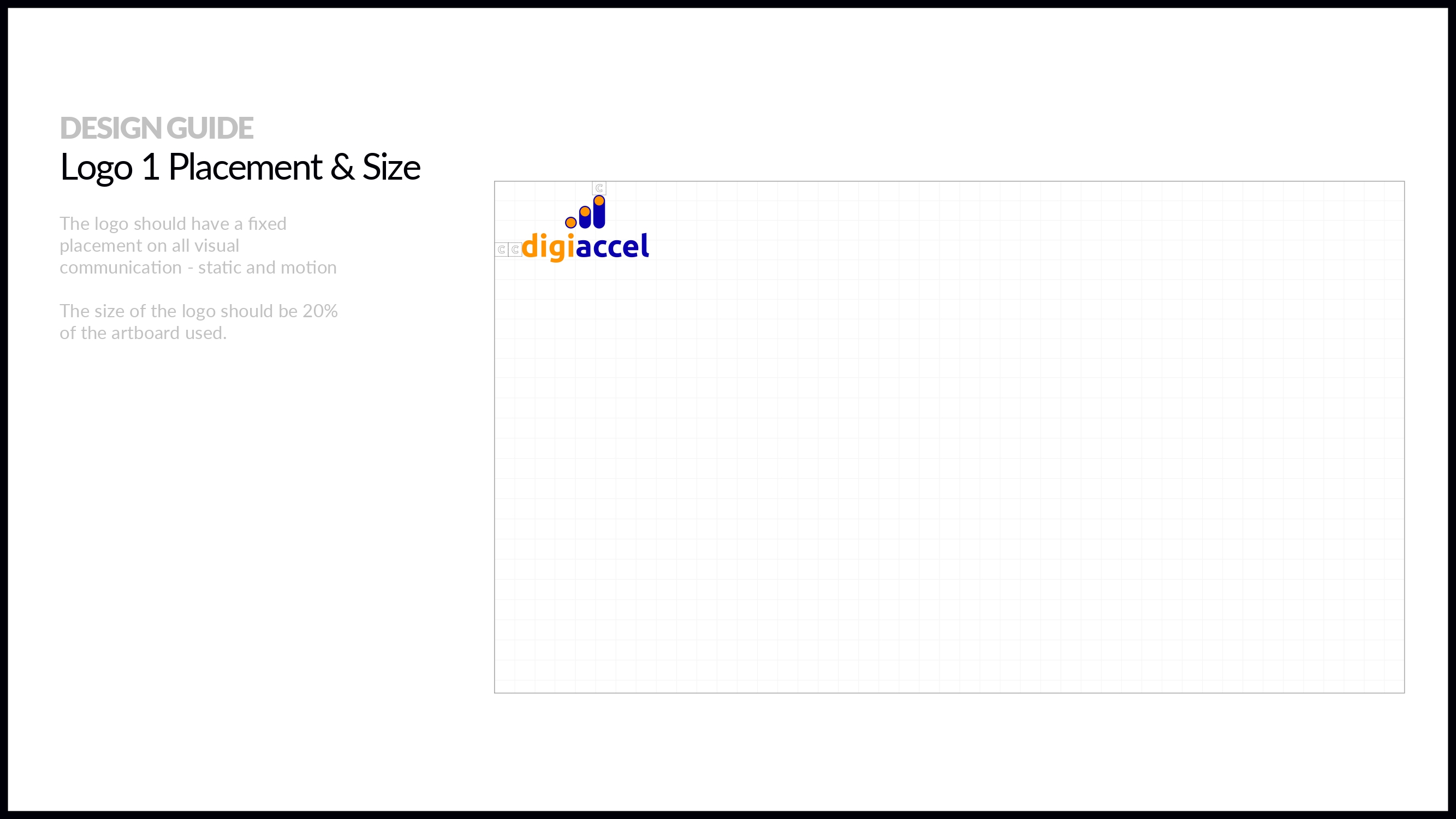
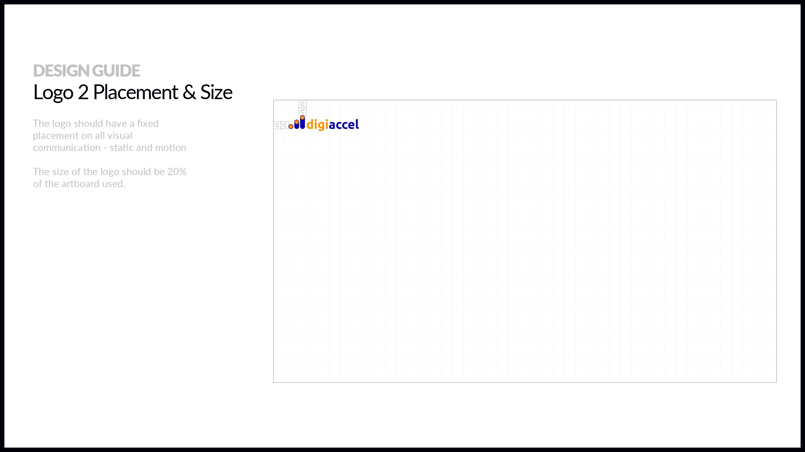
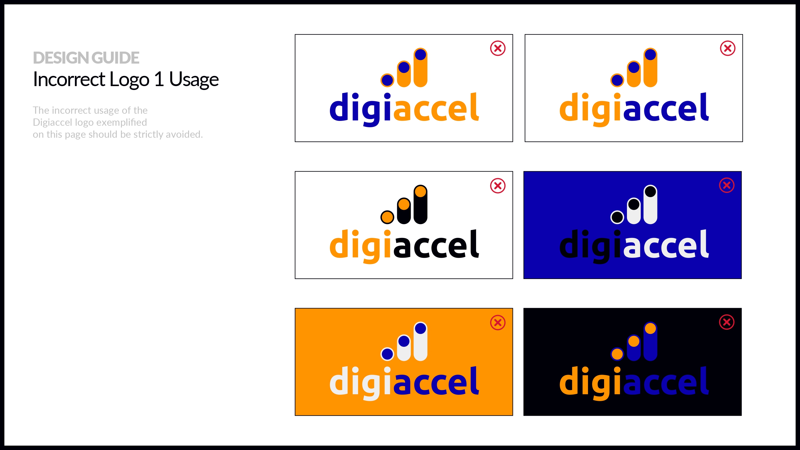
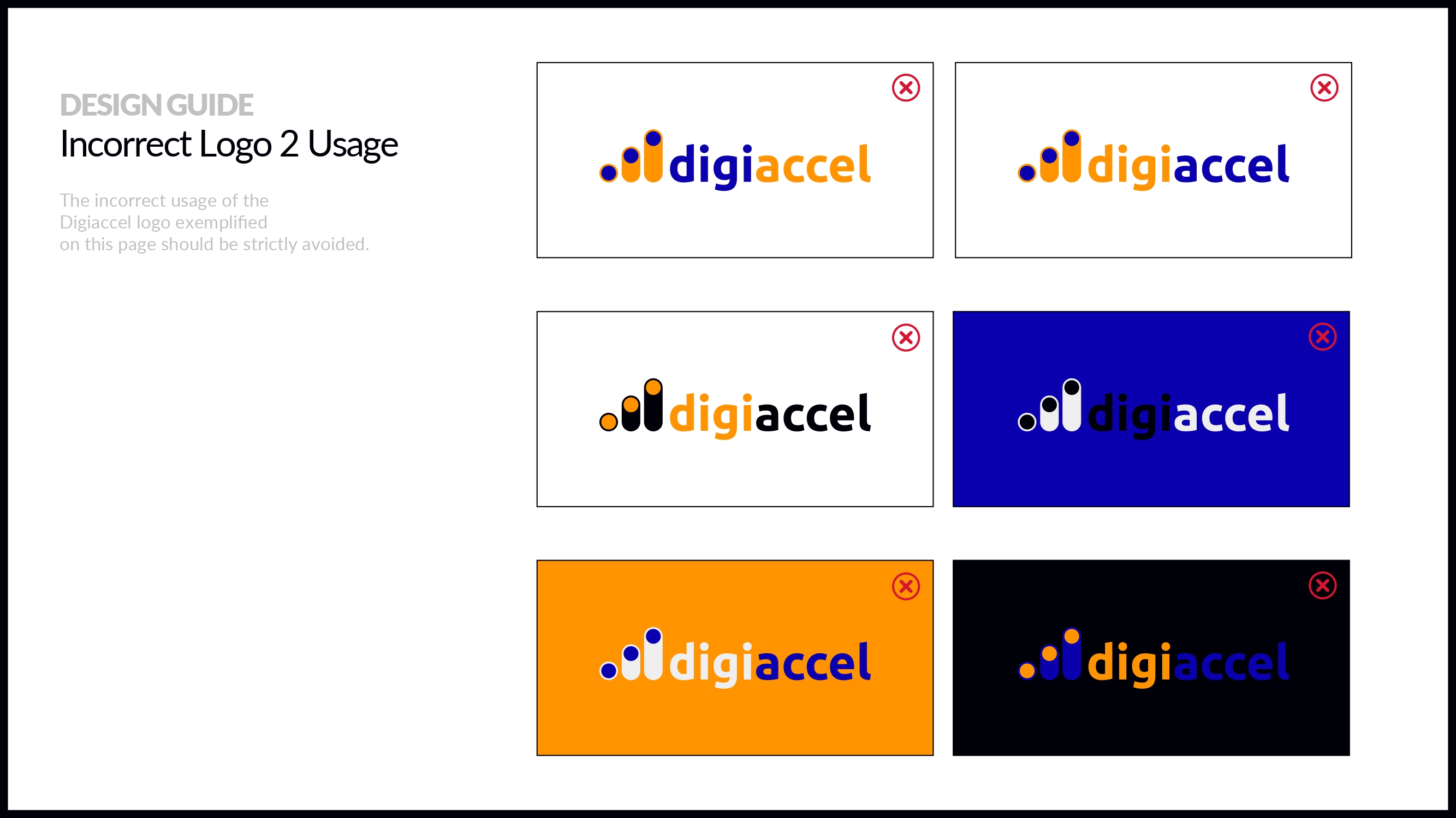
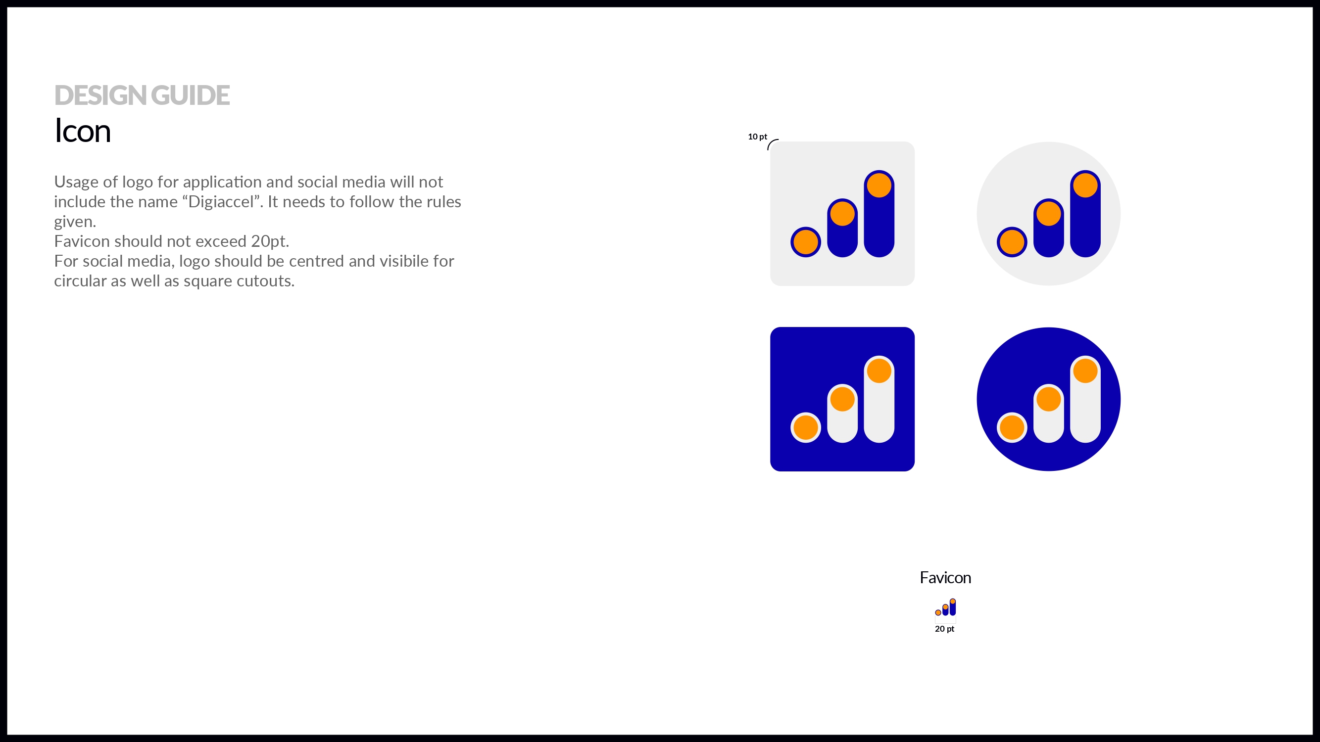
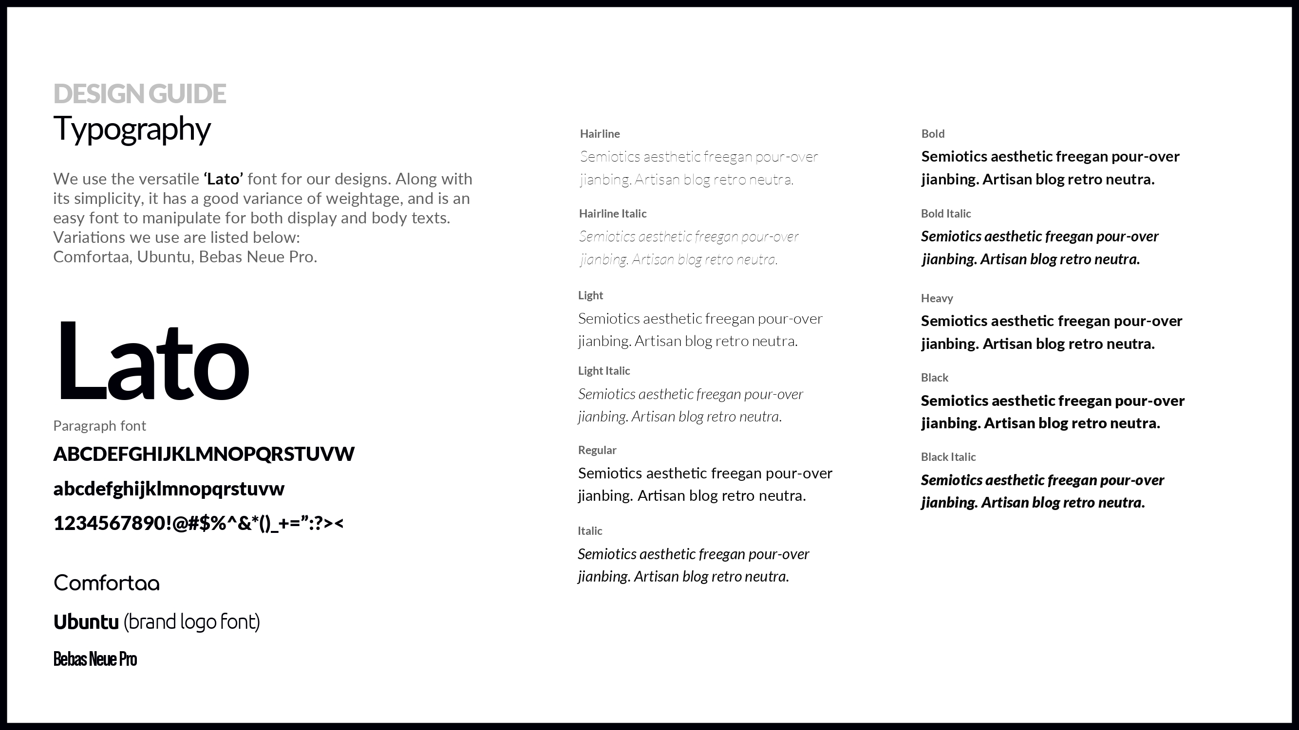
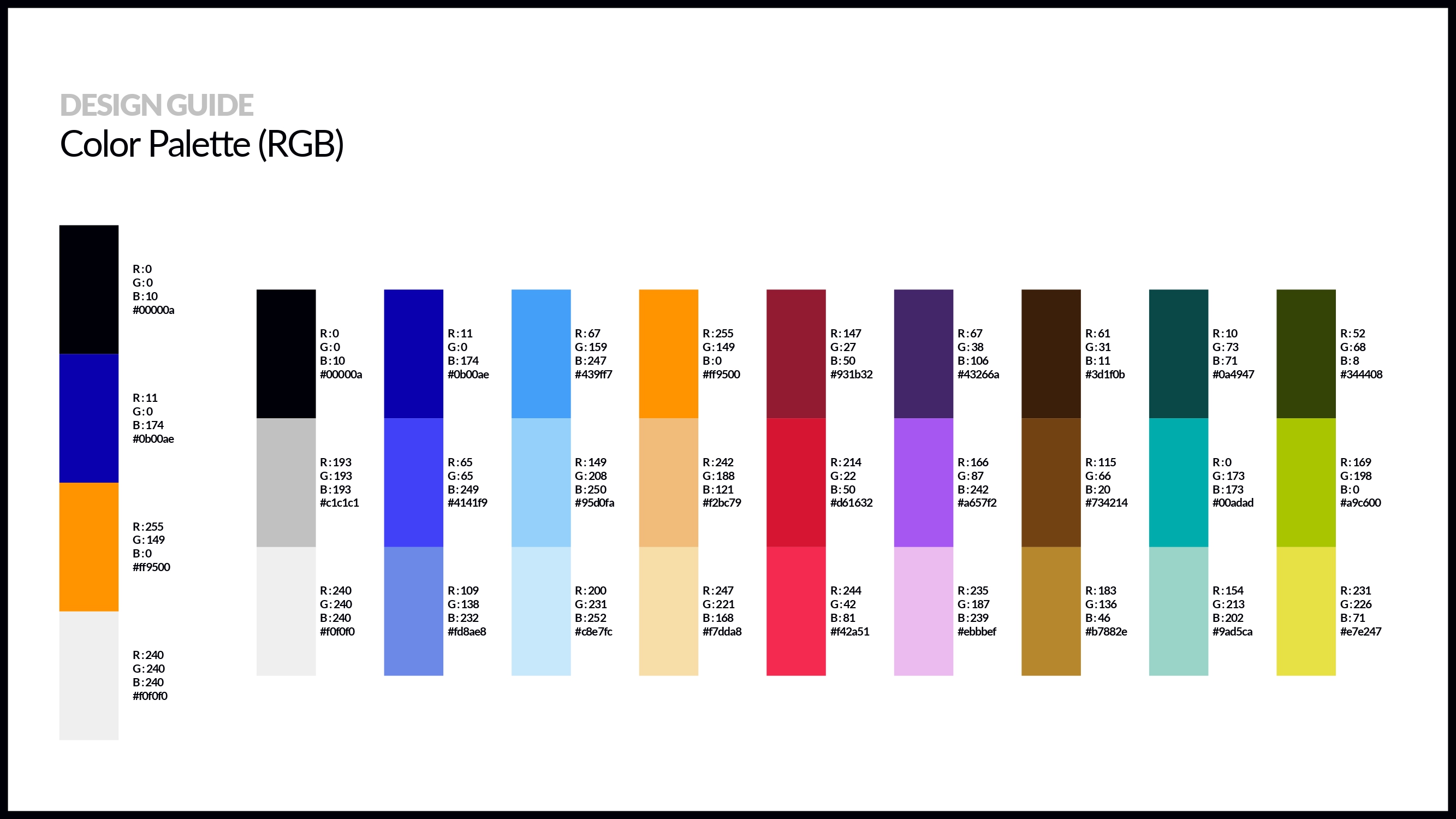
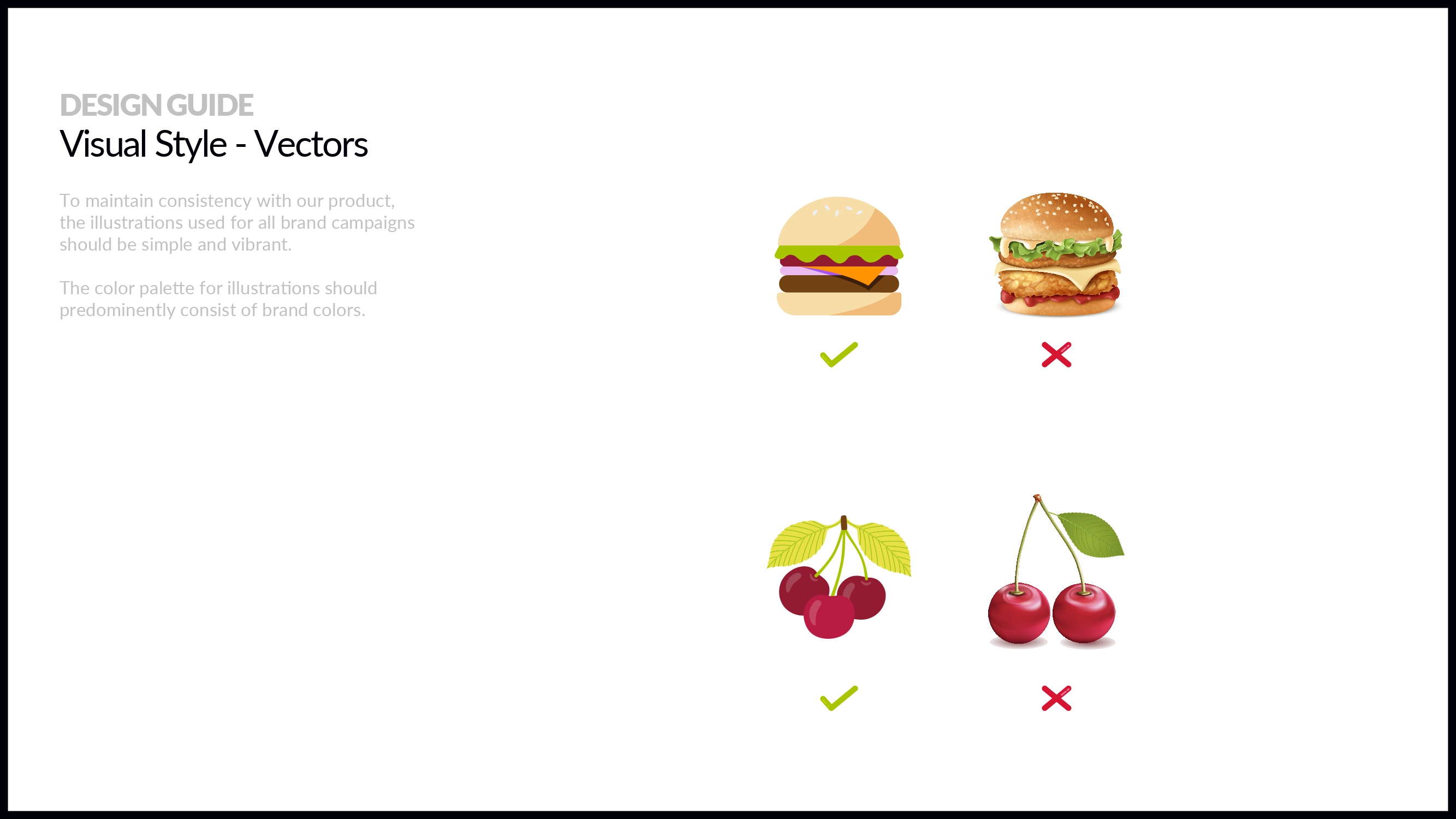
A significant part of the process involved refining the logo and its applications — exploring form, balance, and hierarchy to ensure it remained legible, recognisable, and adaptable across different contexts. Supporting elements such as icon usage, typography, colour, and illustration style were defined to work together as a cohesive system rather than isolated components.
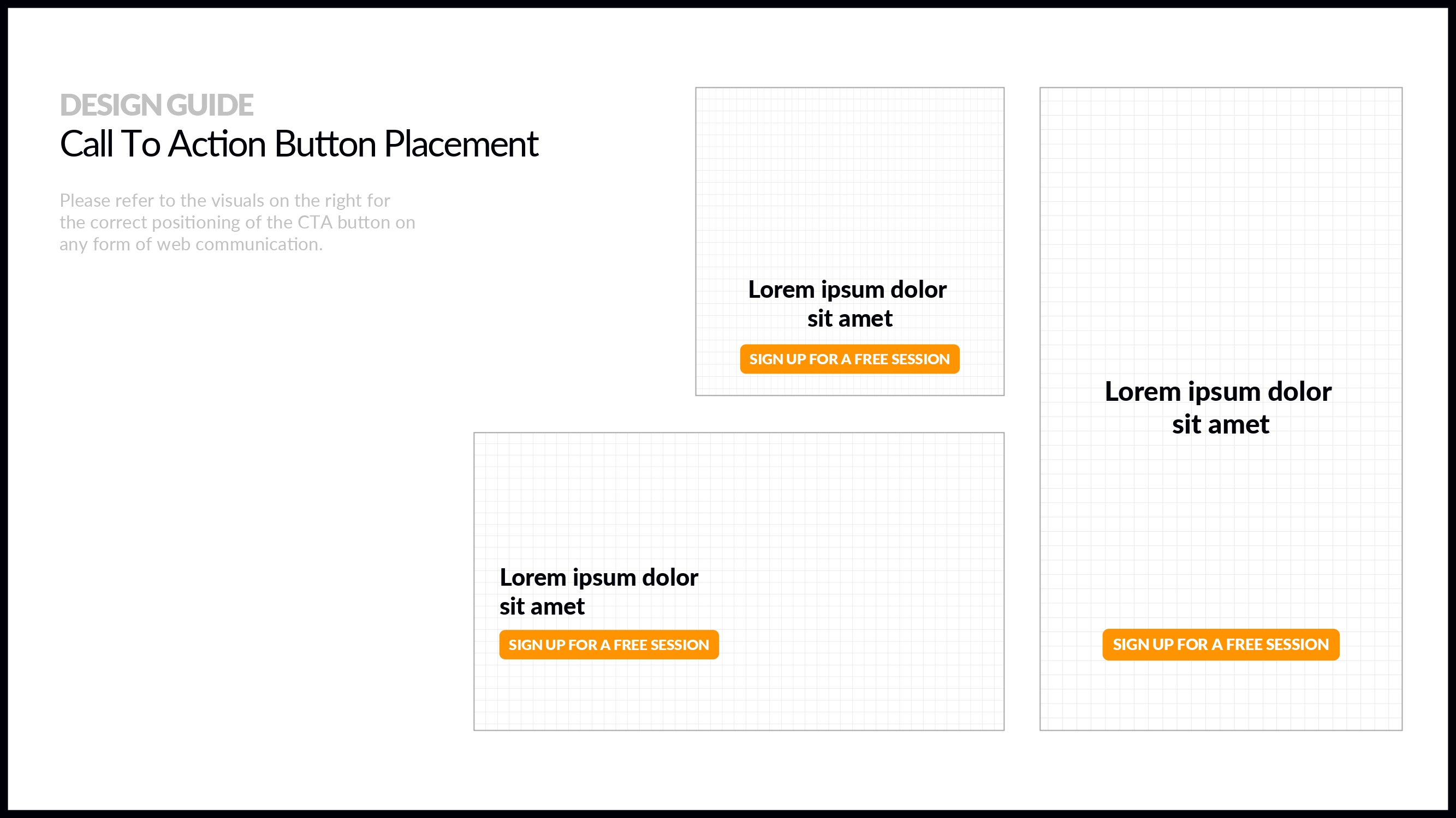
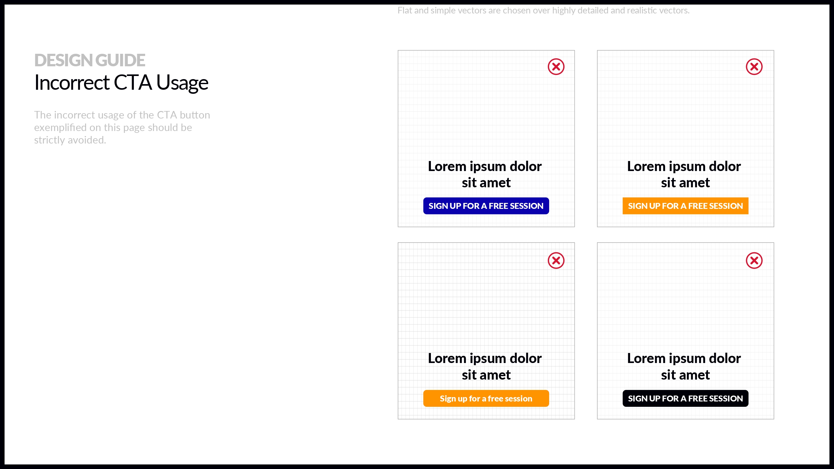
The resulting brand guide acts less as a rulebook and more as a framework — offering clear boundaries while allowing enough flexibility for campaigns and content to evolve over time. The focus throughout was on creating a system that feels purposeful, consistent, and easy to apply in real-world scenarios.